UI/UX
| Usability Heuristics | |
| Visibility of System Status |
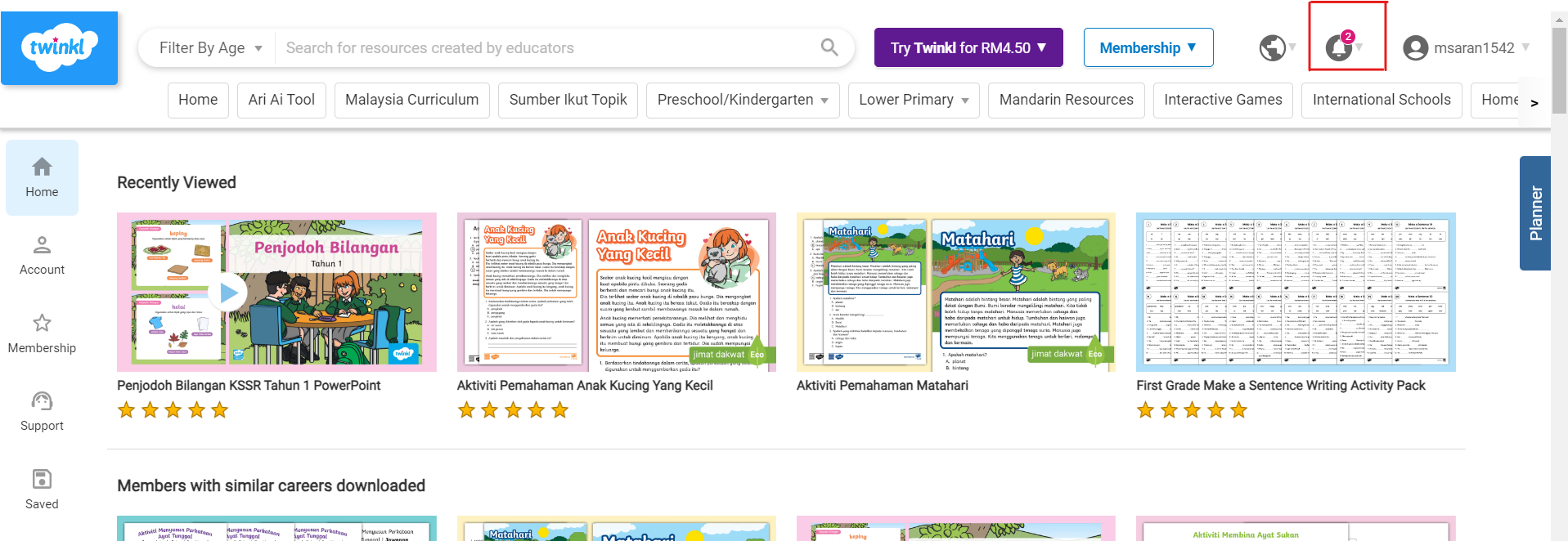
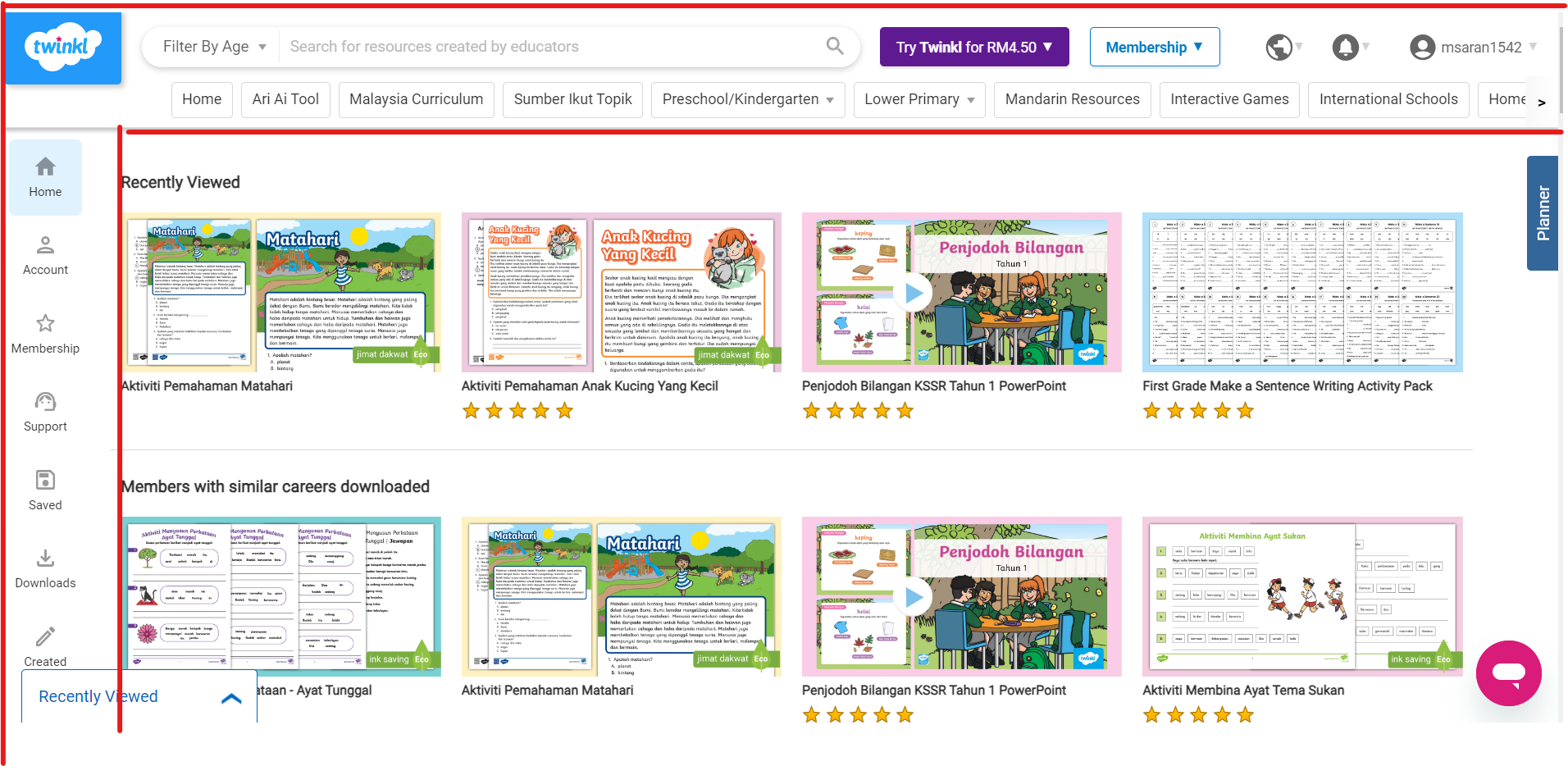
Users are kept informed about informed about what is going on through notification icon
|
| Match between System and the Real World | Twinkl uses words and phrases that are commonly used by educators and learners throughout the website |
| User Control and Freedom | - Home button is clear and visible. Users can click on Twinkl logo or the home button which is placed as the first button on the ribbon |
| Consistency and Standards |
|
| Error Prevention | Twinkl asks for confirmation before continuing with purchase |
| Recognition Rather than Recall | |
| Flexibility and Efficiency of Use | Users able to customize the content/resource according to preference |
| Aesthetic and Minimalist Design | Minimal colour focusing more on showing the content in a single page. Icons for some features |
| Recognize, Diagnose and Recover from Errors | |
| Help and Documentation |
Help button in the form of chatbot |
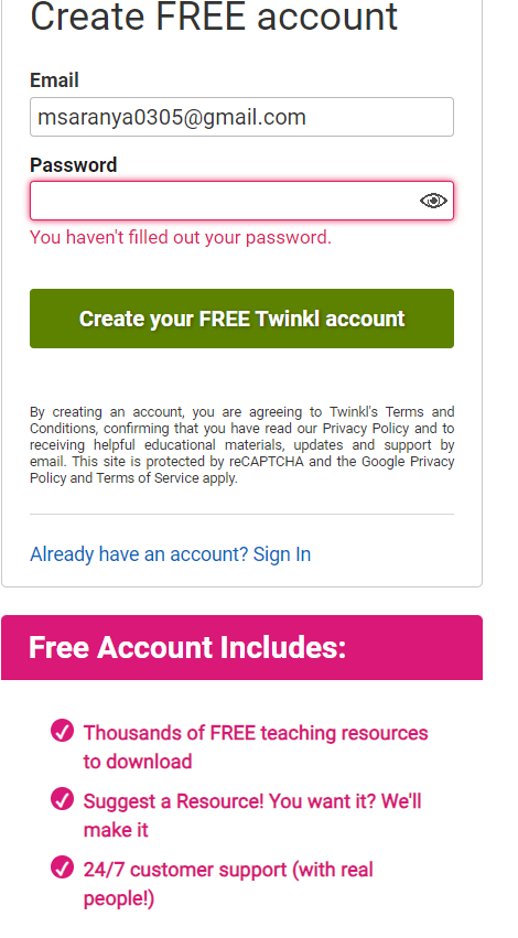
New User Account Creation
|
Feature Description |
Review |
|
Sign in options create account in Twinkl |
|
Dashboard page
|
Ribbons on top - Content Ribbon on the left - Account setting & preferences Planner tab on right - Folder and lesson planning
|
|
|
Membership |
Individual School & Organisations
|
No Comments